- B2B Growth Insights
- Posts
- How Mailchimp Grew to $800M ARR
How Mailchimp Grew to $800M ARR
The hidden conversion killer in their "free" plan that's driving users to competitors
Henry Berry
March 11, 2025
Insights from today’s 3-min read:
🎯 How Sunk Cost Psychology Can Double Your Conversion Rate
🧪 The A/B Test Mailchimp Desperately Needs to Run
💰 Why Asking for Payment Before Value is Killing Conversions

👋 Henry here, welcome to B2B Growth Insights, where I take my learnings from being at Pricepoint Partners to showcase how the best B2B SaaS companies do pricing, growth, and retention.
😢 Mailchimp’s Onboarding
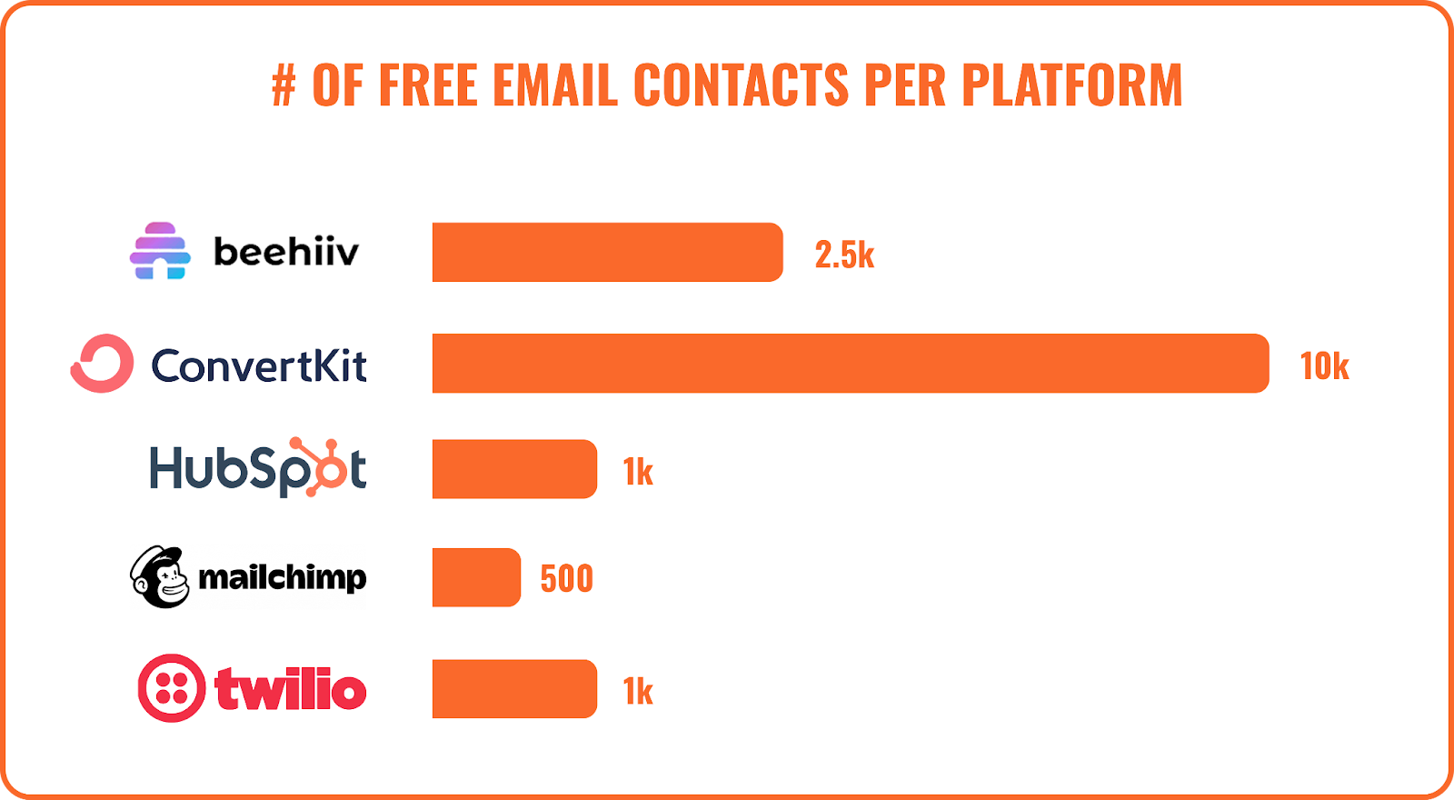
What do they do well? Mailchimp has adopted a freemium business model, where your first 500 contacts are free. This is great, giving the potential for anyone, from a single-person business to a marketer at a 500 person company the ability to try out their product, and see some of the killer features.
This has very much been a response to competition flooding into the email marketing space and offering 1k-10k free users.

What is wrong with their pricing?
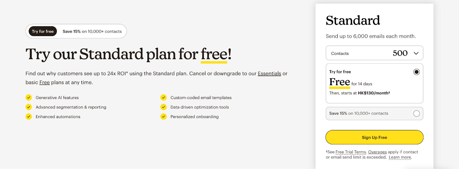
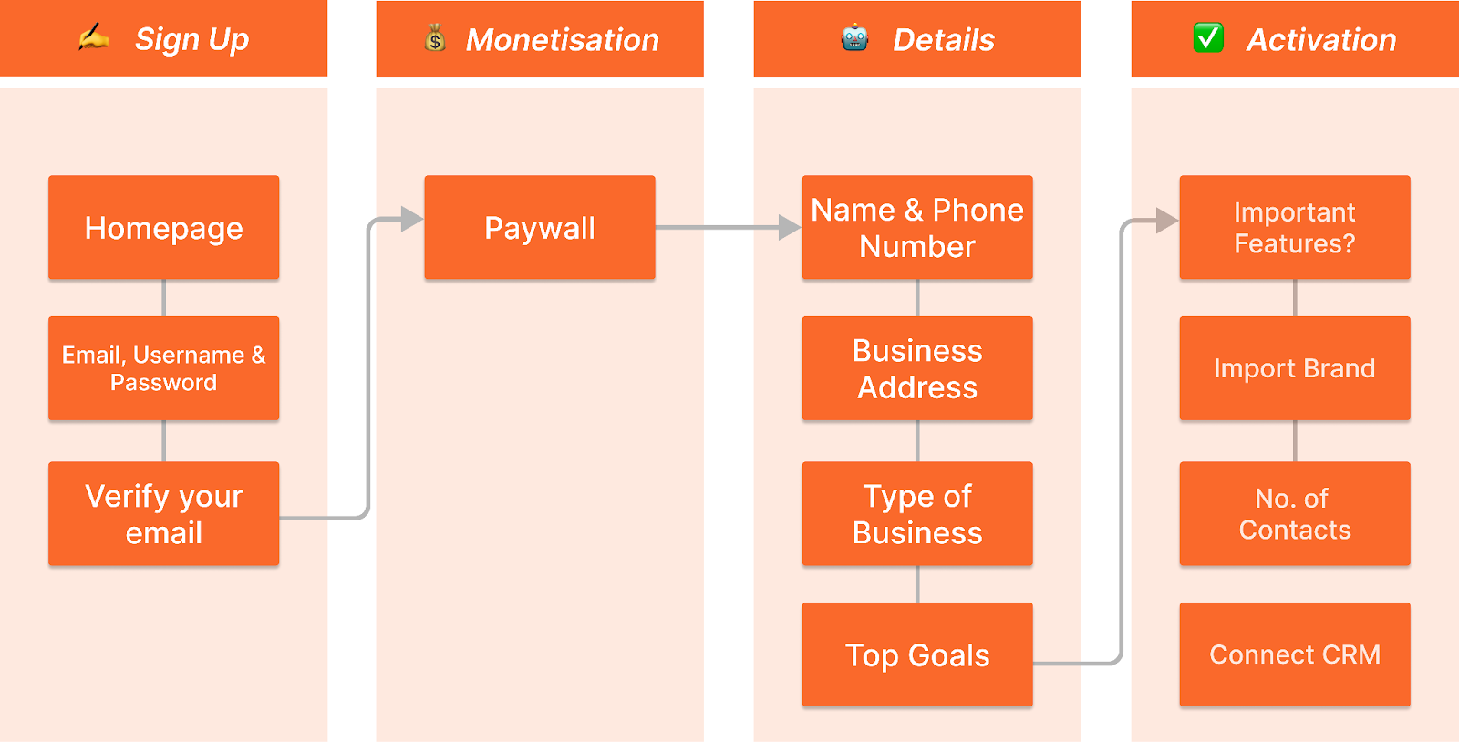
However, this isn’t what we actually see in practice. As soon as you get into onboarding the first thing they do is ask for your contact info, and then show you a paywall.
But I thought this was free?
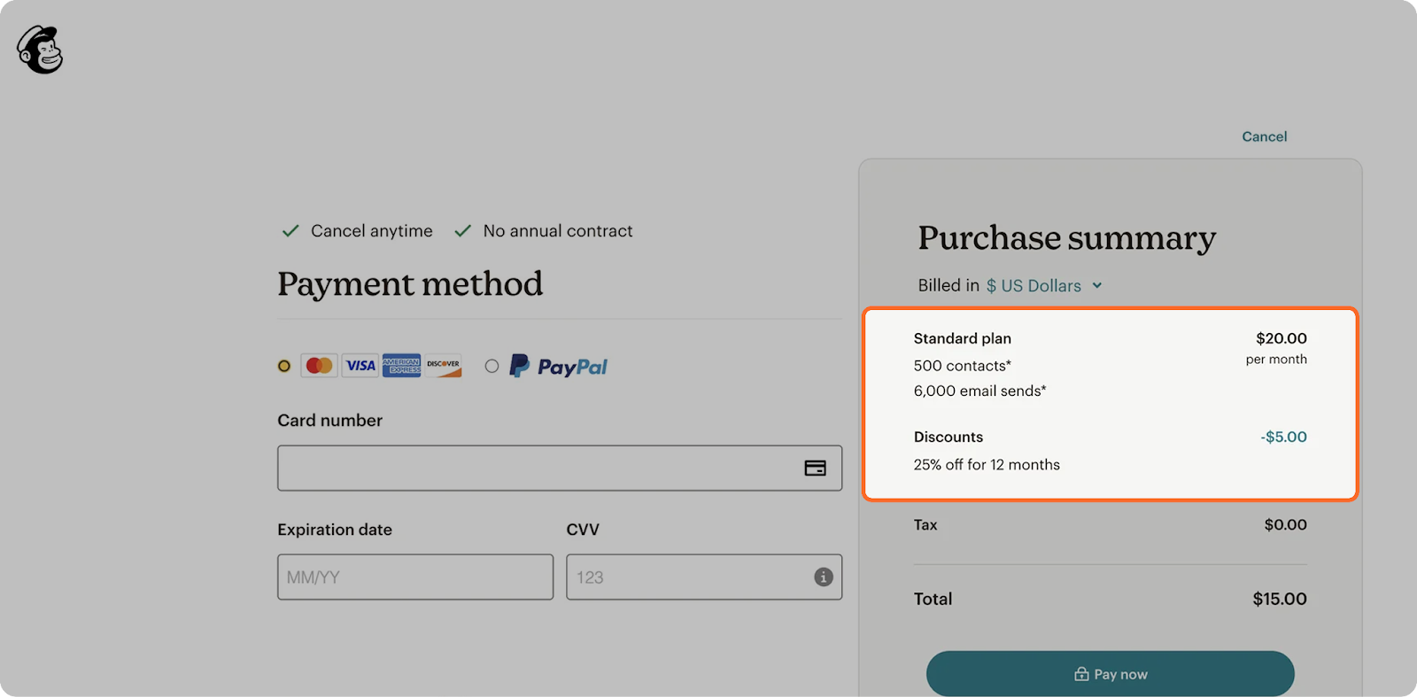
Yes, well it is - technically. Mailchimp will give you the 500 contacts for free, but then default bundle in 6,000 monthly email sends which costs $20/month.
There’s a couple of things wrong with this approach:
❌ Ask for High-Commitment Info Last: You’re asking for high-commitment info like personal details and payment info at the start of onboarding, when users aren’t fully sold -- causing a huge drop-off rate.
❌ Show Users Value First: You’re not showing them the platform, just asking them to hand over cash. Competitors like Beehiiv throw you into the platform and let you experience value with unlimited email sends. Once a user hits 2.5k they know all the features well and are primed to upgrade.

How does the rest of Mailchimp’s onboarding look?
As we continue to progress through onboarding the issues get worse.
Whilst the setup associated with email marketing makes onboarding tough, Mailchimp tries to get a new user to do all of this on Day 1. Before anyone can actually experience the product they need to get through 12 screens, including connecting your CRM platform, verifying your email and more.
However, if by some miracle a user does have the motivation to complete all the steps they’re directed to a surprisingly good onboarding checklist!
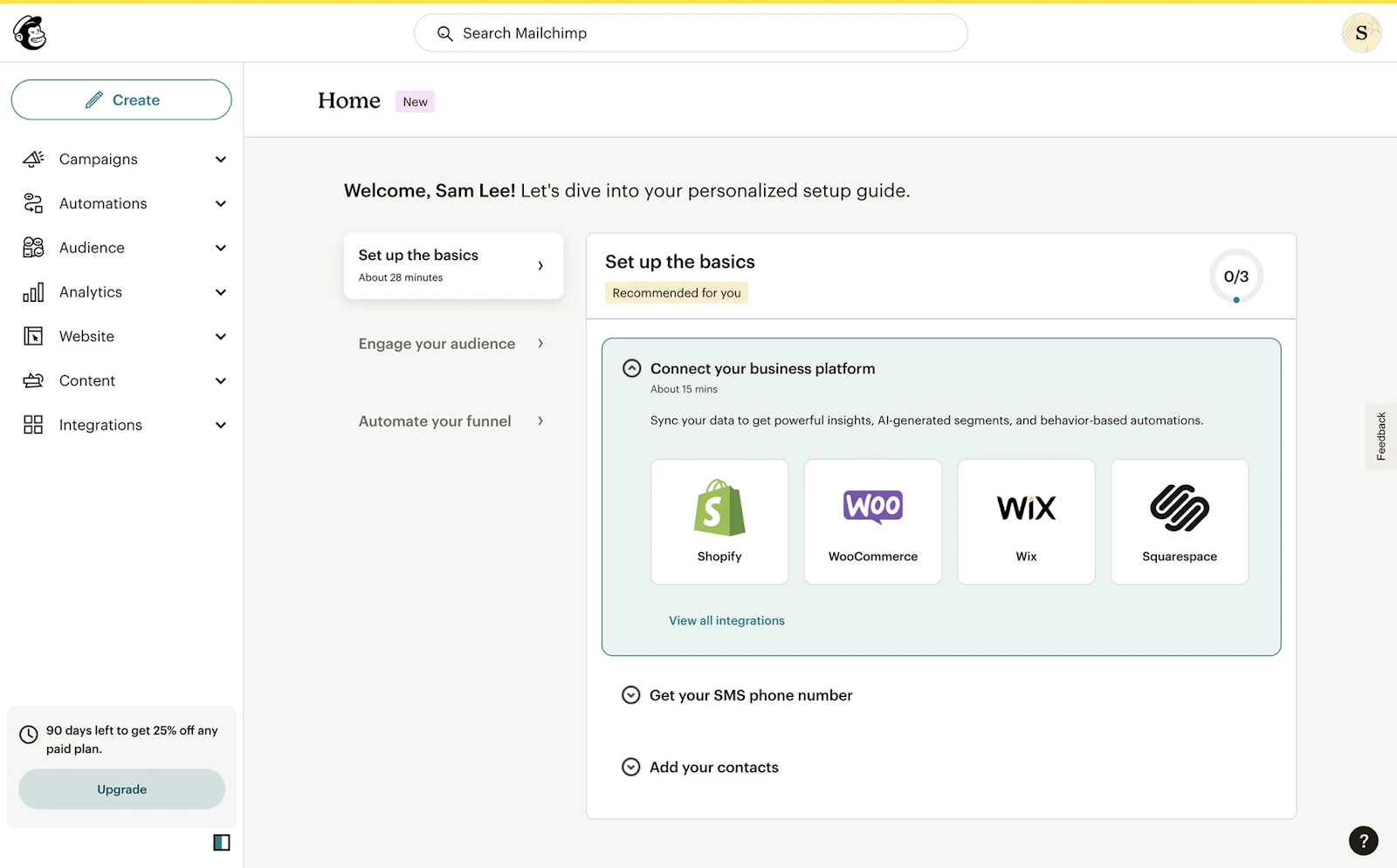
Let’s run through why it’s good:
✅ Rest of the page UI is very clean preventing users getting overwhelmed
✅ Gives users a very manageable number of tasks to complete (only 3)
✅ Shows a user’s progress (0/3 tasks completed), encouraging them to finish onboarding
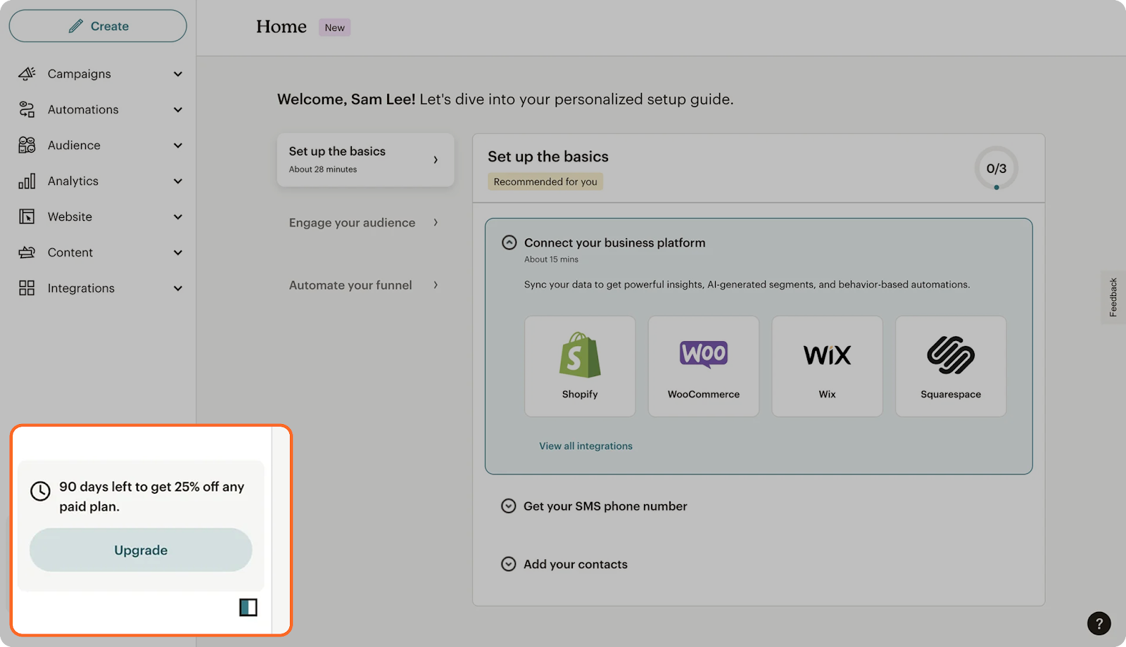
❌ Progress Starts at 0%: Seeing the number 0 is pretty discouraging. Instead Mailchimp should count one of the steps they completed in onboarding (e.g. create account) meaning they start at 25% manufacturing a sense of progress

How could we improve Mailchimp’s onboarding & monetisation?
The main thing to focus on would be getting users into the platform as fast as possible.
Cut out all the fluff, remove the 12 steps. Help users create a super basic account (email, password) and get them drafting their first email as fast as possible.
This increases the conversion from homepage visit-to-paid massively for a few reasons:
✅ Shift Onboarding After Payment: As mentioned previously a user has to complete 12 steps in onboarding, some necessary (e.g. providing your business address for anti-spam laws). These tank conversions but you can still require them after a user writes the email, sees the paywall, and before they ever send their first email.
✅ Contextual Paywall: Right now the main way to upgrade in Mailchimp’s product is a tiny little tooltip - not super compelling right?
Contextual paywalls are when a paywall is shown because of an action a user has tried to do.
Example: You tried to access a feature but it’s for Premium users so the system asks if you’d like to upgrade.
Contextual paywalls convert better because the user understands the immediate need to upgrade. For Mailchimp this would be once they upload a customer list or try to send their first email.
✅ Builds Sunk Cost: At this point a user sees a paywall once they’ve spent 20 minutes writing their first email and uploading their customer list. They’re far more likely to pay because they don’t want to feel like all their previous effort was wasted time (this is the sunk cost fallacy).