- B2B Growth Insights
- Posts
- 🧪 Pricing Pages Are Dead. What's Next?
🧪 Pricing Pages Are Dead. What's Next?
Feature lists are the conversion killer nobody's talking about
Henry Berry
May 05, 2025
Insights from today’s 4-min read:
👀 Moving your paywall to the homepage could double revenue
🔮 What Monday.com tried that almost worked (but missed two critical elements)
🚀 How Riverside captured early-funnel visitors traditional pricing pages ignore
🛑 The reason people aren’t clicking to your Pricing Page

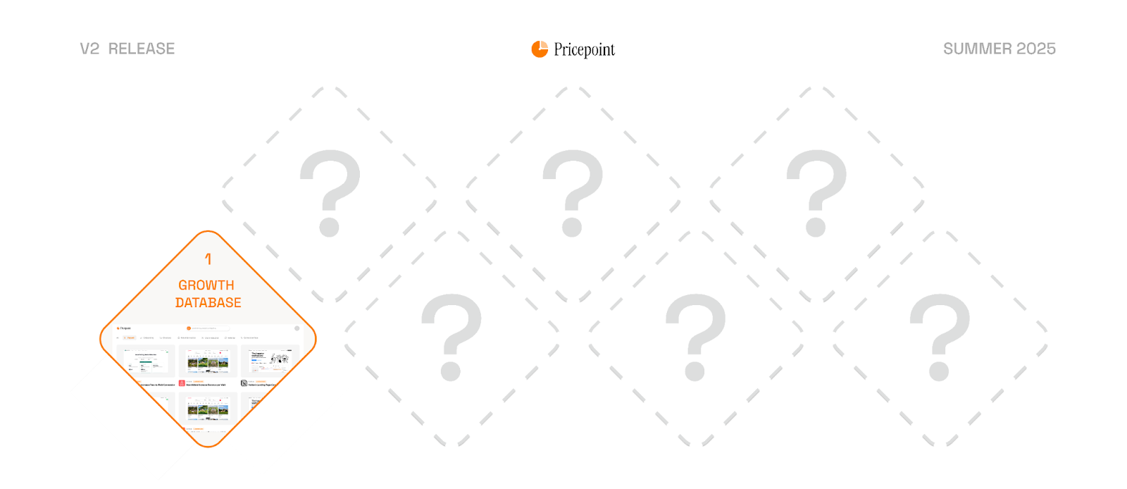
👀 New Project Sneak Peek: 1,000 Growth Hacks from the World’s Best Brands
Over the last 2 years I’ve chatted to hundreds of subscribers. So many have either not been able to afford long consulting contracts or just wanted tools that do 80% of the work.
With advancements in AI and the growth of Pricepoint’s consulting we’ve been spending the last 2 years building tools that will allow anyone to become a saas growth expert.
Over the next 4 months we’ll be rolling out a series of 7 major releases that will allow any startup to have 80% of what a BigTech company would pay a growth team for at a fraction of the cost.
Today, we’re teasing the first of the 7 releases: a database with hundreds of the most successful growth tests that will allow you to steal the playbooks of the world’s highest converting products.
Loom & Riverside: How Interactive Paywalls Are Changing The Game
Last week, I spent far too many hours comparing high-converting landing pages. After reviewing more than 85 options, two stood out — not just for their features, but for something completely unexpected: their paywalls.
Yes, you read that right. Their paywalls.
Both Loom and Riverside have completely reimagined how SaaS pricing pages should work by developing interactive paywalls that are honestly... brilliant.
And they're solving a problem most SaaS companies don't even realize they have.
Let's dive in...
The Problem with Traditional SaaS Pricing Pages 🥱
Most SaaS companies follow a pricing formula so predictable you could generate it with an AI prompt:
Link to pricing page buried in top navigation
3-4 pricing tiers arranged in columns
Long, overwhelming lists of features with checkmarks
Annual discount toggle (commit to 12 months, save 15-20%)
Look familiar?
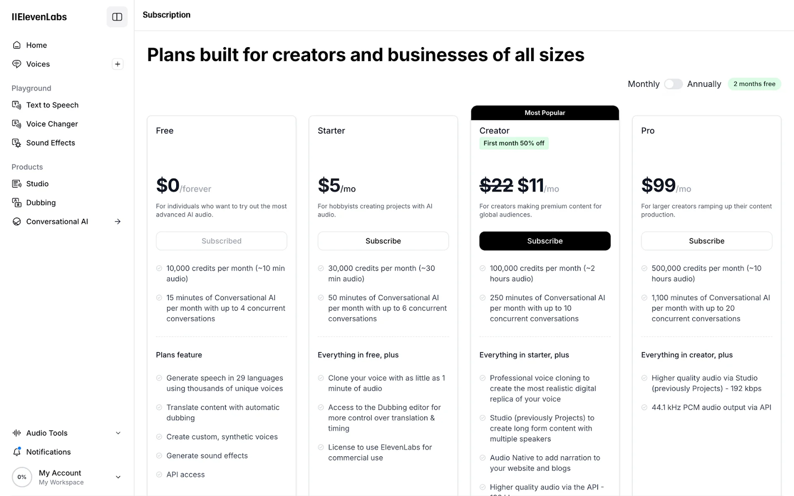
ElevenLabs Pricing Page
This approach isn't necessarily bad. After all, there's something to be said for familiarity. When every B2B SaaS pricing page follows the same pattern, prospects understand the UX immediately because they've seen it a hundred times before.
But traditional pricing pages have two massive problems:
❌ They don't highlight what's special about the product or showcase killer features
❌ They don't actually demonstrate the features in action
Some companies have tried to address this. Monday.com, for example, attaches little "Watch why Standard/Pro" videos to their tiers to explain the value proposition better.
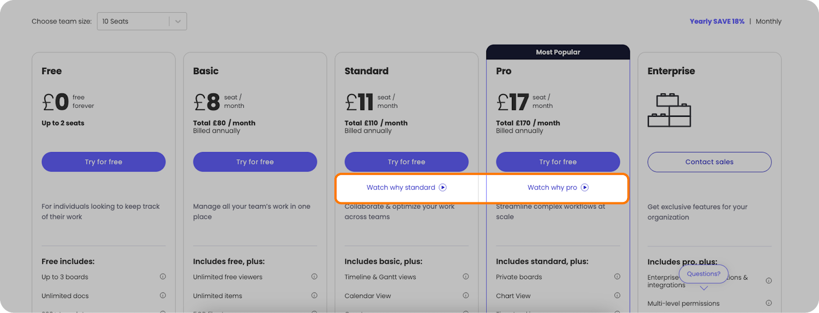
Monday.com Pricing Page
It's a nice conversion boost to premium tiers and helps buyers understand differences between plans.
But it still doesn't solve two critical issues:
❌ Only helps high-intent visitors: Only people who actively click to pricing (a tiny percentage of site traffic) ever see these videos
❌ Information overload persists: You're still staring at an overwhelming grid of features with minimal visual hierarchy
Interactive Paywall 🚀
Both Loom and Riverside have recently introduced what I'm calling "interactive paywalls", and they're completely changing the game.
Instead of a static wall of text and checkmarks, they've created engaging interfaces where you:
See a select list of killer features on the left
Click any feature you're interested in
Immediately see a visual demonstration of that feature on the right
This approach is powerful.
Remember when everyone started saying "a picture is worth a thousand words"? It's especially true for SaaS products. Buyers don't want to imagine what your "Advanced Analytics Dashboard" might look like — they want to see it in action.
And because you can pick which features to explore, you engage more willingly. You're not forced to scan through 40+ features — you can focus on what matters to your specific use case.
Here's what Loom's interactive paywall looks like:
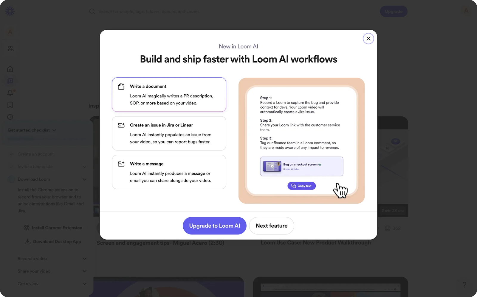
Loom Pricing Page
And Riverside's:
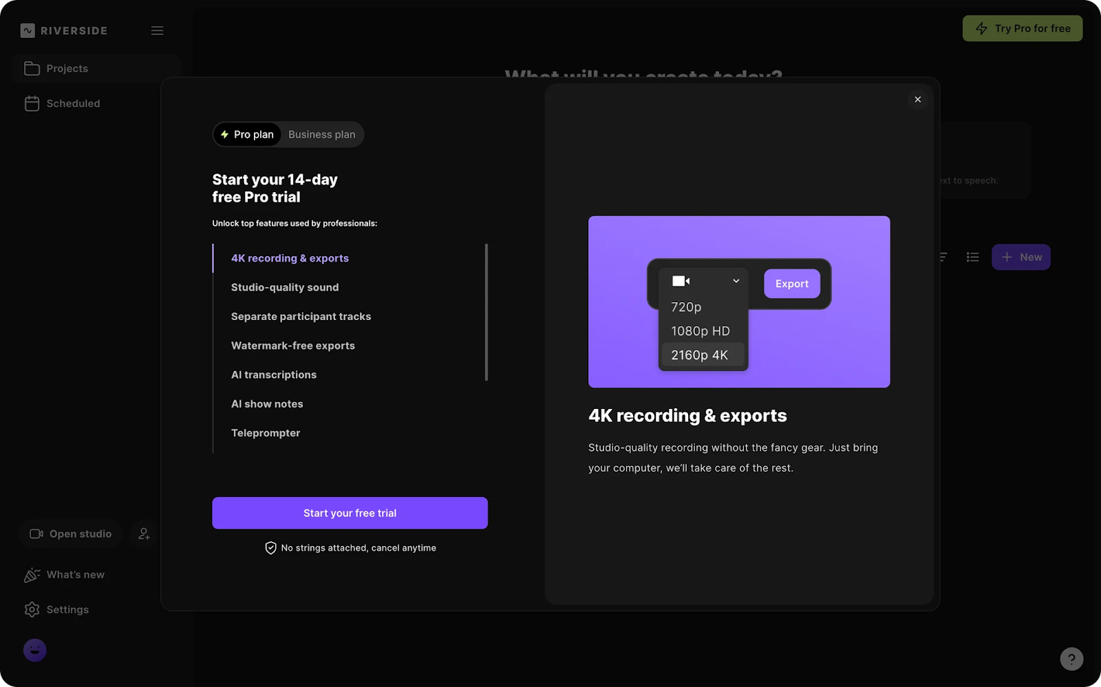
Riverside Pricing Page
The Strategy Behind Interactive Paywalls 🧠
The brilliance of these interactive paywalls goes beyond just better UX. It's about strategy.
Because they don't look like traditional pricing pages, both companies can place them prominently on their homepages — getting nearly everyone to see their value proposition, not just the small percentage of high-intent visitors who click "Pricing."
This is straight from the e-commerce playbook. Online retailers have known forever that most first-time visitors won't buy immediately, so capturing contact information for email marketing is crucial.
Loom and Riverside take this concept further. Instead of offering a generic lead magnet or 10% discount, they show every homepage visitor a mini interactive paywall that effectively communicates their value.
The result? Vastly increased willingness to pay.
Why It Works: The Psychology Behind Interactive Paywalls 🧪
These interactive paywalls work for several psychological reasons:
Active engagement: Clicking through features creates investment in the product
Visual processing: We understand and remember visual information better than text
Self-directed exploration: Letting users choose what to explore increases motivation
Reduced cognitive load: Focusing on one feature at a time prevents overwhelm
Show don't tell: Demonstrations are more convincing than descriptions
Together, these factors create a much more compelling path to conversion than traditional pricing pages.
Key Takeaways ✅
If you're rethinking your SaaS pricing experience, consider these lessons from Loom and Riverside:
Showcase, don't just list: Show your features in action rather than just naming them
Prioritize killer features: Focus on the 5-7 features that actually drive purchasing decisions
Put pricing elements earlier in the journey: Don't hide value behind a "Pricing" navigation link
Make exploration interactive: Let users self-direct their discovery process
Reduce cognitive load: Break complex information into digestible, visual chunks
What do you think? Have you seen other innovative approaches to SaaS pricing? Drop me a reply if you’ve found any you like!